Graphic design is art with a purpose. It involves a creative and systematic plan to solve a problem or achieve certain objectives, with the use of images, symbols or even words. It is visual communication and the aesthetic expression of concepts and ideas using various graphic elements and tools.
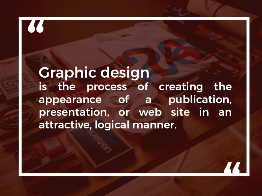
Graphic design, also known as communication design, is the art and practice of planning and projecting ideas and experiences with visual and textual content. The form it takes can be physical or virtual and can include images, words, or graphics. The experience can take place in an instant or over a long period of time. The work can happen at any scale, from the design of a single postage stamp to a national postal signage system. It can be intended for a small number of people, such as a one-off or limited-edition book or exhibition design, or can be seen by millions, as with the interlinked digital and physical content of an international news organization. It can also be for any purpose, whether commercial, educational, cultural, or political.
Design that’s to be experienced in an instant is the easiest to recognize. Designers arrange type, form, and image on posters, advertisements, packages, and other printed matter, as well as information visualizations and graphics for newspapers and magazines.
This kind of design is often confused with illustration, but while an illustrator creates or draws an image in response to an idea, a designer combines illustrations, photographs, and type in order to communicate an idea. One way to understand this is to consider the difference between a furniture maker and an interior designer. One makes a specific object for a specific purpose, while the other thinks about how all of the objects and surfaces of a room create an environment for the person moving through it. Good illustrators are often capable designers and vice versa, making it harder to distinguish between the two practices.
Motion graphics are equally predetermined and crafted but are meant to be experienced over a fixed time span, like the opening credits of a movie or an online video that explains part of a newspaper article. They usually go beyond the visual, curating and cueing sound to moving vector graphics, photographs, and video. The difference between motion graphics and videography or animation is the same as the difference between two-dimensional graphics and illustration. Motion graphics combine animation, videography, and typography for a communicative purpose, and this combination over time and the space of the screen constitutes the design.
Whether physical or digital, books and magazines are meant to be enjoyed over time, during which the reader has control over the pace and sequence of the experience. In books, the content usually comes before the design, while in magazines, the design is a structure that anticipates written and visual content that hasn’t yet been created. Some commercial websites or exhibition catalogues also fit in this category, as do digital or physical museum displays that show information that doesn’t change. All have content in a suggested order that has been thought about ahead of time, but the user or reader finds his or her own path through the material.
Many designers also produce systems that are meant to be experienced over time but aren’t confined to the making of objects. Wayfinding, a form of environmental graphics, refers to branding and signage applied throughout and on buildings or outdoor areas like parks or highways. While each sign or symbol in wayfinding is a work of design, together they form a larger system that helps people navigate while maintaining a sense of the character of where they are. The design of the system—the relationships among all of those parts—is where the designer brings greatest value.
The larger category of environmental graphics includes any design that connects a person to a place, extending to and overlapping with dynamic displays, didactic type and imagery, and creative placemaking. A wall of terminals that show arriving and departing flights, a digital display on the facade of a building that shows stock prices, an inspirational quote in a building lobby, and a placard explaining a historical place or landmark are all examples of environmental graphics.
Similar to wayfinding, branding pulls together all of the artifacts of a commercial or institutional brand, like a business card, a sign, a logo, or an advertisement, into a visual system. How those are experienced over time is the design work. No part is created without considering the other parts or without thinking about how the target customer will first encounter the brand and then develop a relationship with that brand over time. In the twentieth century, a consumer often had just a few touchpoints for a brand. For example, if you were to fly somewhere, you would see expressions of the airline on your ticket, at the gate, on the plane, on the uniforms of the flight attendants, and on various printed items on the plane, like the blankets, napkins, or in-flight magazines. Perhaps you would have seen a print or television ad. Today, your experience still includes all of these items, but now it begins well before you arrive at the airport, when you buy your ticket on the airline’s website and receive an email confirmation, and carries through to a safety video and interactive options on board. Once you’ve arrived at your destination, you may also receive follow-ups by email asking about your experience on the trip or inviting you to further interact with the brand. This expansion of touchpoints overlaps with almost every medium and considers a much longer span of engagement with the customer.*
Designers are also responsible for interactive designs where the content changes as it gets updated, as well as screen interfaces that help people navigate through a lot of information. Interaction design differentiates itself from other kinds of design by adding another consideration: responding to the actions of the viewer or user. Editorial design for web and mobile is the most tangible example, including websites and mobile apps for publication. Some digital design involves the presentation of rapidly changing streaming information, also known as data visualization, creating both interactive and non-interactive interfaces. Product design refers to the design of digital products, which are digital services, tools, or platforms that can be brought to market. The term is confusing because for several decades “product design” has referred only to industrially produced physical items like radios, benches, and bicycles and has been used interchangeably with “industrial design.” Related to software design, product design requires knowledge both about how computers process, sort, and display information as well as how humans interface with computers. Many companies and the designers who work for them aim for their products to be used by large numbers of people around the world, so they often rely on widely accepted design patterns and metaphors and prioritize usability and functionality over aesthetic expression. For large or complex projects, different designers may work on the user interface (UI), which refers to the affect and layout of what the user sees in the moment, and the user experience (UX), or the total experience of users over time as they move through websites or mobile apps.
Depending on the scale of the context in which a designer works, the work may include one, some, or all of these things in the course of a year. Larger companies, agencies, teams, or studios may employ a number of specialists, while smaller studios and groups may need to have each individual capable, if not an expert, in multiple areas. Higher-level creative direction or managerial positions usually require expertise in at least two additional areas beyond basic competence in design: domain expertise (knowing what is happening in a particular business sector) and further knowledge and experience in team management or client relations. While having a job in design requires knowledge in only one area, having a career in design requires expertise in more than one medium and more than one area of the design process.
7 Basic Elements of Graphic Design
Color
Sir Isaac Newton is widely credited with creating the very first color wheel back in 1706. As the story goes, Newton took the spectrum of colors produced when light passes through a prism (red, orange, yellow, green, blue, indigo, and violet) and arranged them in a segmented circle. When the circle was spun rapidly on a rotating disk, the colors blurred together, appearing completely white to the human eye.
Below, you can get an idea of how Newton’s color wheel likely appeared. This 1708 version was illustrated by the French painter, Claude Boutet, and makes reference to Newton’s color theory research.
 Newton’s visual categorization system for color was adopted and expanded upon by scientists, artists, and philosophers over the years, eventually resulting in the modern color wheel we all know today.
The modern color wheel consists of three primary colors — red, yellow, and blue — which can theoretically be mixed in varying ratios to produce secondary and intermediate colors. Although modern research tells us that color theory is actually a little more complicated than that, the color wheel is still a valuable tool for graphic designers looking for aesthetically pleasing color combinations.
When selecting hues for a project, consider colors that appear directly opposite or beside each other on the color wheel — these tend to produce the most consistently pleasing combinations. You could also consider using a free online color scheming tool, like ColorSchemer, to do the work for you.

Color in Action:
This example from ∆ Studio–JQ ∆ is a great example of complimentary colors in action. Violet and yellow, which appear directly opposite on the modern color wheel, produce a bold, visually appealing effect when paired together.

Line
Lines are more than just dividers — the right lines can convey movement and emotion, tying together your composition and making it looked polished and professional.
Rikard Rodin, a graphic designer and blogger with over 15 years of design experience, explains that lines can form the underlying architecture of your project. Defining the line of movement in your composition before you get started can help you construct a design that achieves the desired mood.
“You can use mood lines in virtually every element of your design,” Rodin writes on his blog. “Or you can contrast different mood lines in different parts of your design to create a more layered design. Take, for example, the ‘STABLE’ mood line. You can use this in creating your layout. You can use it in your photography. And you can use it in your font selection.”
Mood lines don’t have to be visible in your final composition — they can simply act as a guide to provide structure and direction as you work. Of course, line can also be visibly incorporated into your final design as well.

Line in Action:
Designer Alexander Koltsov and the folks at Shuka Design created this stunning visual identity for the 2016 World Chess Championship in New York. The team used purposeful but asymmetrical swirls of overlapping lines to represent “the thought process of a chess player.”

Scale
The scale of different elements in a design will have a big impact on how your audience views and makes sense of your composition. Playing with the relative size of different components in your design allows you to set a focal point, highlight areas of importance, and ultimately guide viewers’ eyes through the piece.
Scale isn’t quite the same thing as size (though many people tend to incorrectly use them interchangeably when discussing design, i.e., “Make the logo bigger!”). Size refers to an absolute measurement (e.g., the sheet of paper 8” by 11”) while scale refers to the direct relationship between elements in a design (e.g., the circle is twice as big as the square).
You can use scale to create a visual hierarchy for your design. When an element is displayed at a relatively larger scale than the other elements in a composition, our eyes are naturally drawn to it.

Scale in Action:
To create a sense of drama and importance, New York-based graphic designer Aurelio Sánchez Escudero uses a high-contrast scale between elements in these promotional materials for San Francisco’s Social Innovation Week.

Shape
Shapes: they’re not just for preschoolers! A shape can be loosely explained as anything defined by boundaries. There are two categories of shapes to consider:
Geometric shapes, which are defined by perfect, uniform proportions (such as a circle, square, triangle), and organic shapes, which have less well-defined edges, free-flowing proportions, and essentially no rules (such as wiggly, blob-like things that don’t fit into any real category).

When working on a design, consider both the shapes you’re deliberately incorporating (the positive shapes), and the shapes naturally formed around those shapes (the negative shapes).

Perhaps the most famous example illustrating the distinction of positive and negative shapes is Rubin’s vase. Developed in 1915 Danishpsychologist Edgar Rubin, this now-ubiquitous optical illusion shows two completely different images when the negative shapes are viewed vs. when the positive shapes are viewed.
Learn more about how our brains view shapes and make sense of design in the video below:
Shape in Action:
The humble circle has always been a popular, trusty way to display information in a clean, unified composition. Sydney-based Made Somewhere developed this simple, modern logo for Hidden Gems of Sydney, a blog focused on highlighting local attractions in the area.

Alignment
Think of alignment like an invisible axis that runs between elements, connecting them visually either by their edges or centers (see the image below).
Alignment most frequently comes up in design discussions about text and typography, but it’s equally important to consider the alignment of non-text elements when building a balanced, orderly composition.

The example above illustrates uniform edge and center alignment — but that doesn’t mean all the elements in your composition always have to follow a single pattern of alignment. In the image below, you can see the elements are aligned by their edges, but not united by a single axis.

Alignment in Action:
Oscar Riera Ojeda Publishers designed this minimal book cover for Chasing the Sky, a book that honors the careers of influential female architects. The title typography is aligned around a geometric shape.

Contrast
Contrast refers to the juxtaposition of elements that strongly differ (big vs. small, light vs. dark, etc.) to create visual interest or draw attention to particular elements.
Without contrast, our designs aren’t just lackluster and boring to look at, they’re also difficult to understand. A lack of contrast is often what separates mediocre design work from designs that look professional, polished, and clear.
Take the images below for example — in the picture on the left, there isn’t adequate contrast between the background photo of the man working at a desk and the white text. It’s not so easy on the eyes, and the message is difficult to comprehend. In the image on the right, the background has been darkened to create more contrast, making the text way easier to read.

Contrast in Action:
The team at Barcelona-based toormix expertly plays with varying contrasts in this poster design for Barcelona Design Week 2016.

Space
Space is exactly what it sounds like: the empty areas between elements in your design. When it comes to creating professional-looking designs on your own, sometimes what you don’t include is just as important as what you do.
When working on a design, consider not only the elements you’re including (such as images and text) but how they’re arranged and grouped in the composition. It can be tempting to fill every inch of your digital canvas with something, but try to give your elements some room to breathe.
In the example below, you can see how changing the space and grouping of the elements creates a completely different feeling in the composition. On the left, the uniform space between the elements creates a sense of order and security. On the right, the varying spaces between the elements conveys a sense of disorder and confusion.

Space in Action:
In this poster from designer Jonathan Lawrence, the text “March Madness” is displayed with unconventional spacing, adding some unexpected visual interest to an otherwise minimal design.

